red hex: ee1b24 blue hex: 8ed6e4
These are the new chosen colours for our project.
They are both bright, youthful - but not too youthful, vivid and energetic while also complimenting each other. The red warmth and passion, where the blue is trust, peace and knowlege.

I came up with the campaign name 'Insite,' which means giving insight as well as a 'site' being a place, and in 'sight' so you're present, seen, heard.
Siobhan mocked up the logo/symbol with the text.
Repeating tile pattern made by Siobhan, using the new symbol.
Pale blue version
Vivid red version

Web Wireframes. magenta's wireframe
Britts wireframe, simple, with bit of scroll.

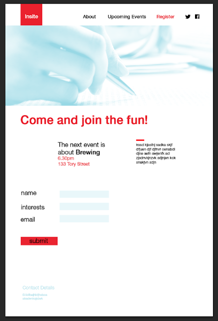
Beginning mock ups of the new website with our new logo, campaign and colour swatches/theme.
Home/About page shown first upon opening the site.
Brief 'hook' into the copy, which will be a relatable statement such as "What even is adulthood?" etc, which will then lead them into the short body copy; bright, bubbly and casual tone of voice and a brief sum up of what you will get out of the event(s). Contact details are found right at the bottom of the site.
The two thumbnail images will take the user to the other two pages of the website, quickly and easily.
Added the pattern at the bottom of the page along with logo to reinforce the campaign brand.
'Upcoming Events' page, where there are the dates and details of any events which are coming up wither later in the year, or in the following year. These will have different 'topics' or 'themes' to them.
Here the user can also download the simple schedule plan for how the night will run.
This is where the user can 'register' to the events, and give a few interests, as well as dietary needs for the event catering.
• Could potentially swap around the blue image gradient map and red type for red gradient mapped images and blue type?
• The font will be changed to futura, and adding in 'dietary' needs to the register page. The copy needs to be filled in and adjusted to the right tone of voice, and this will later go into InVision.
• Jason suggested the website could have the weather outside, or events happening in the area with a customised message directed at the user, to seem like the site is thinking and make it more personal.
He also recommended having a log in, through facebook etc, or at least an option for a connection between facebook, so it can say 'you like or you need..' etc.


No comments:
Post a Comment